KeePer PRO SHOP is a leading automotive supplies and services company with over 6,000 branches in Japan and operations in Hong Kong.
We aim to digitize its work procedure to facilitate the operation with a new service management app for staff and mobile booking app for customers.
Product Type
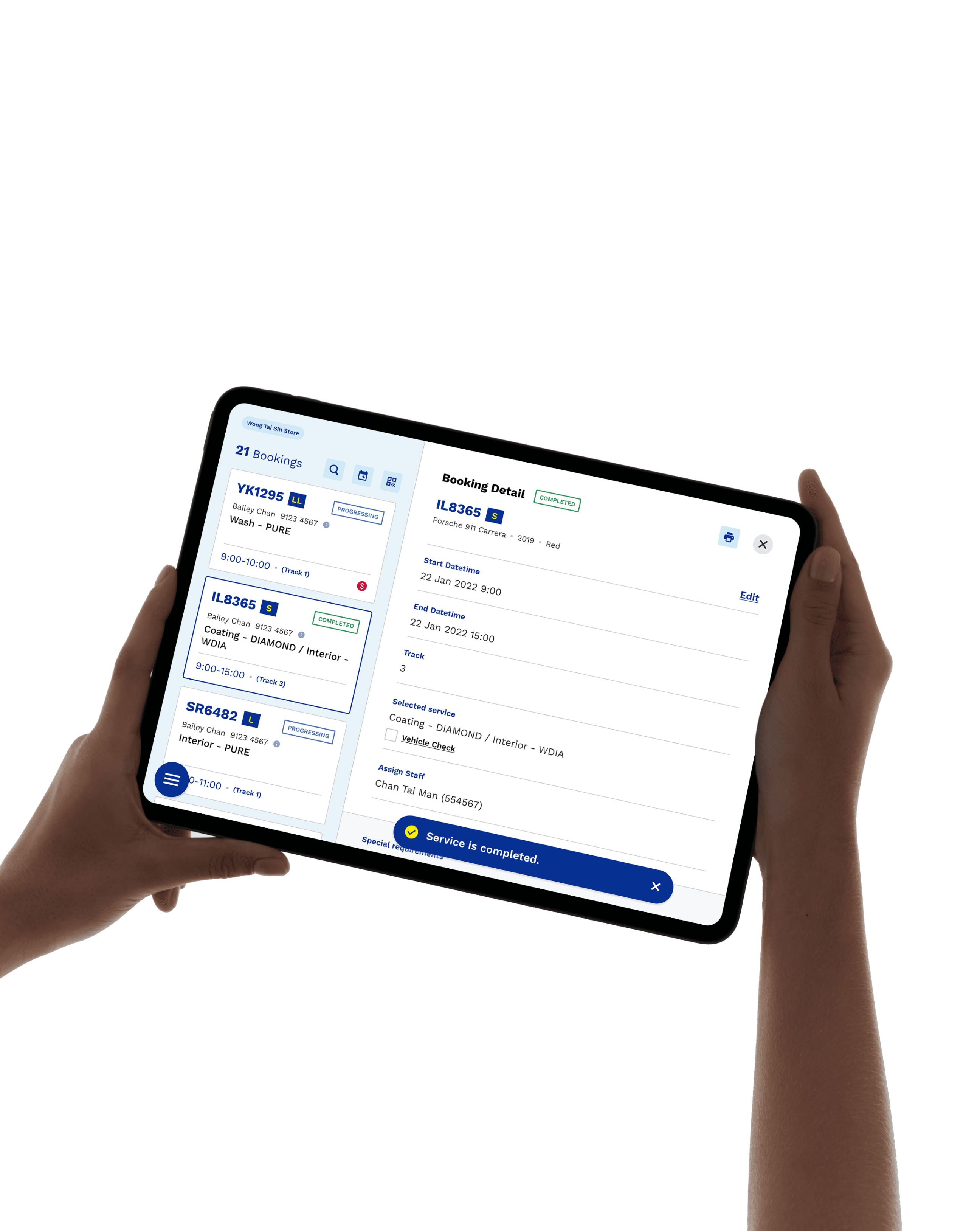
Service management iPad app (staff-use)
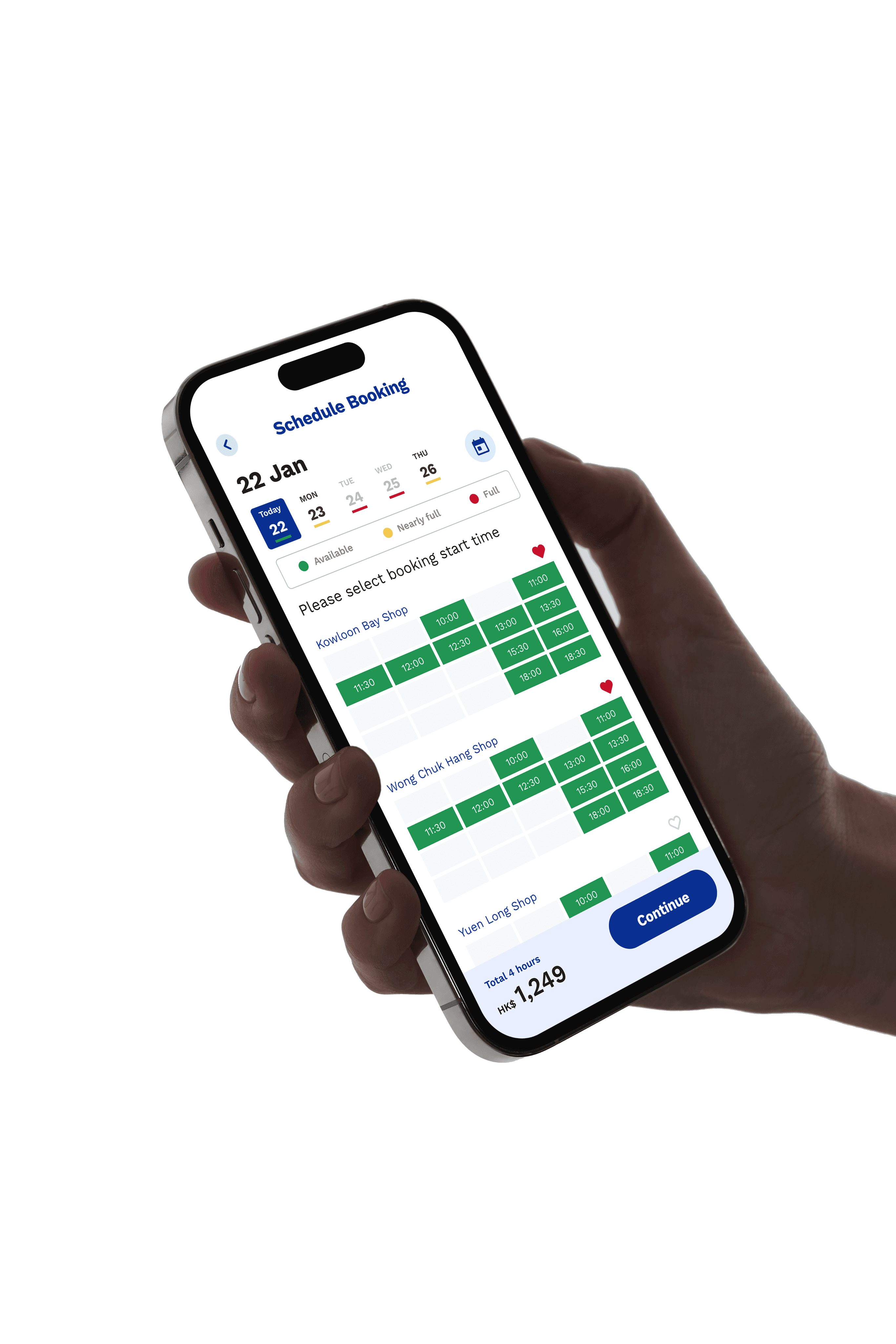
Mobile booking app (customer-use)
Team
Jason Cheung (UI/UX Designer)
Ashley Wo (UI/UX Designer)
Nicholas Au (Tech Manager)
Ruby Hui (Project Manager)
Roy Heung (Business Analysis)




BACKGROUND
Starting Point
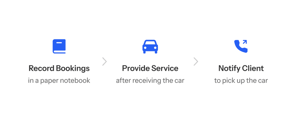
Keeper PRO SHOP has a significant number of loyal customers, but they were still using the traditional approach of paperwork to manage all client and booking details, relying on phone calls as the primary communication channel with customers. This ineffective system, prompting Keeper PRO SHOP to digitize their workflow.

My Role
As one of the two designers, I led the UX/UI, and visual identity design of the service management iPad app. I collaborated closely with the client, users, and engineering team to gather requirements, conduct user testing, execute the design, and ensure quality with phase-by-phase QA.
My Role
As one of the two designers, I led the UX/UI, and visual identity design of the service management iPad app. I collaborated closely with the client, users, and engineering team to gather requirements, conduct user testing, execute the design, and ensure quality with phase-by-phase QA.
RESEARCH
Defining User Needs
Before our team delved into the design deliverables, we needed to ensure we were on the right track. We conducted workshops to establish the client's business objectives and arranged a site visit to the store to engage with the staff and customers.
RESEARCH
Defining User Needs
Before our team delved into the design deliverables, we needed to ensure we were on the right track. We conducted workshops to establish the client's business objectives and arranged a site visit to the store to engage with the staff and customers.
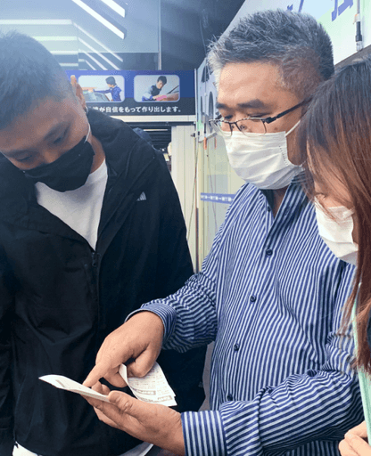
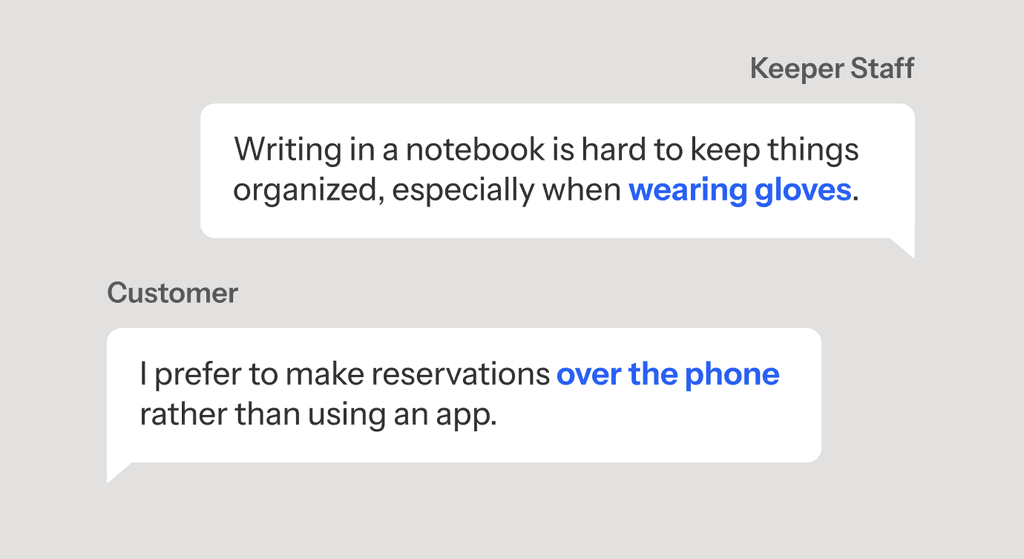

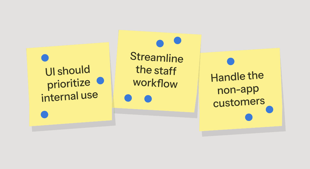

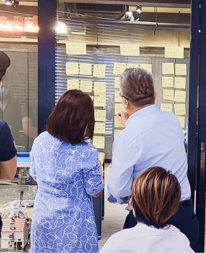
Key insights collected from the workshop and site visit
Key insights collected from the workshop and site visit
Project Goals
Summarizing the insights from the top management, staff and customers during the workshop and site visit, the three key goals were:
Project Goals
Summarizing the insights from the top management, staff and customers during the workshop and site visit, the three key goals were:

Effective Dashboard
Caters to the needs and preferences of the staff.

Effective Dashboard
Caters to the needs and preferences of the staff.

Systemize Workflow
Automate procedures on software level.

Systemize Workflow
Automate procedures on software level.

Customer Onboarding
Handle customers who didn’t book with app.

Customer Onboarding
Handle customers who didn’t book with app.
CO-DESIGN + IDEATION
Design a User-Friendly Dashboard
Designing a good dashboard for internal use can be a challenging task, requiring us to deeply understand the operation and the staff's preferences. To this end, we held an early stage workshop with the staff.
CO-DESIGN + IDEATION
Design a User-Friendly Dashboard
Designing a good dashboard for internal use can be a challenging task, requiring us to deeply understand the operation and the staff's preferences. To this end, we held an early stage workshop with the staff.
Co-Design Using Paper Prototypes with Staff
Although paper-based deliverables may be considered unprofessional, it is the quickest and most collaborative tool we can use with users. We created some paper UI kits for them and asked the staff to arrange the most effective layout. After that, we conducted a card sorting exercise to prioritize all the information they needed on the dashboard for better information hierarchy.
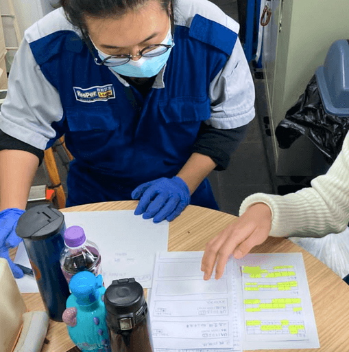

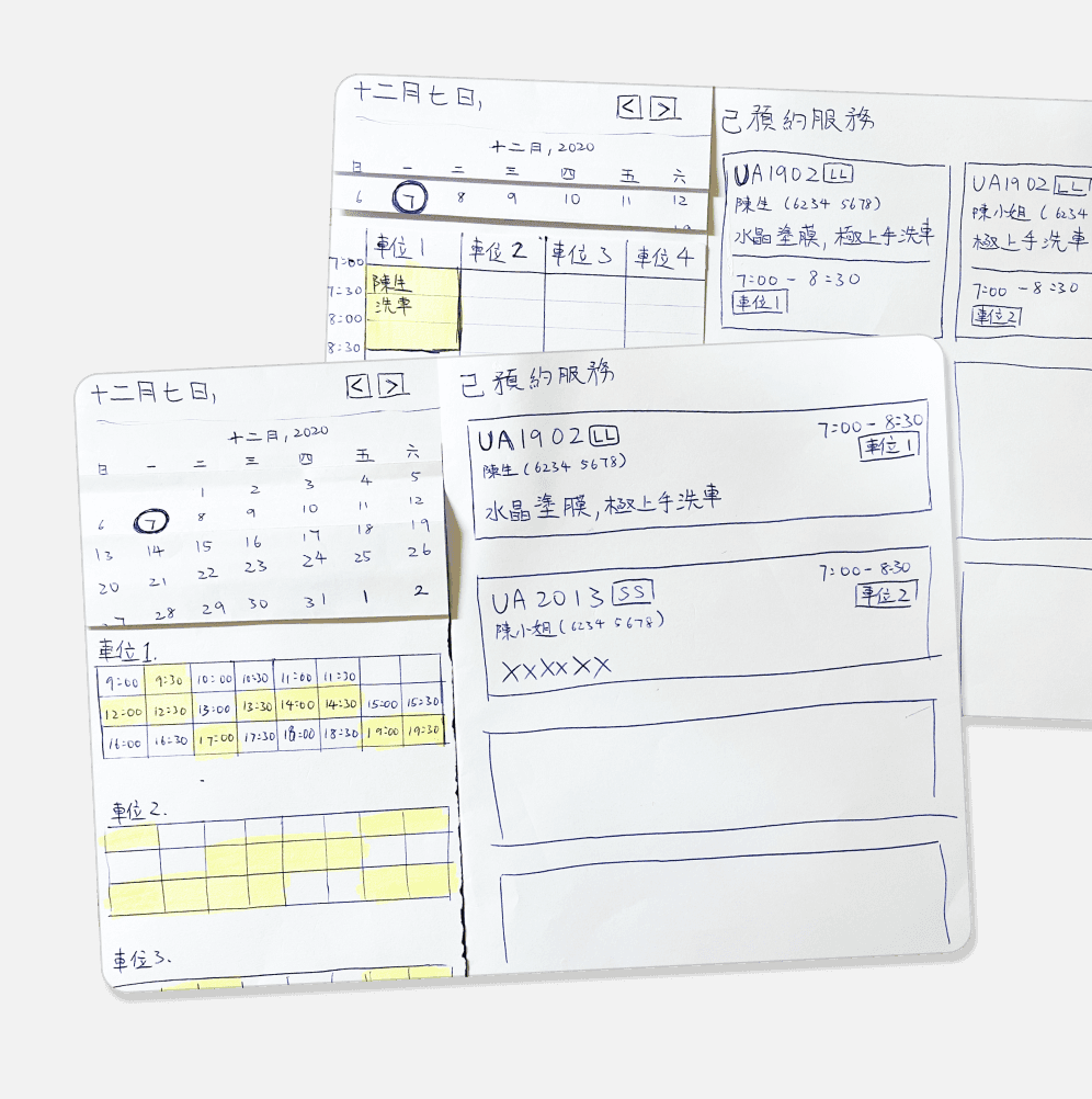

Photo of the workshop with the store staff
Photo of the workshop with the store staff
Final Design of the Dashboard
Building on the insights from the workshop and some universal design principles, we arrived at the final dashboard design:
Final Design of the Dashboard
Building on the insights from the workshop and some universal design principles, we arrived at the final dashboard design:
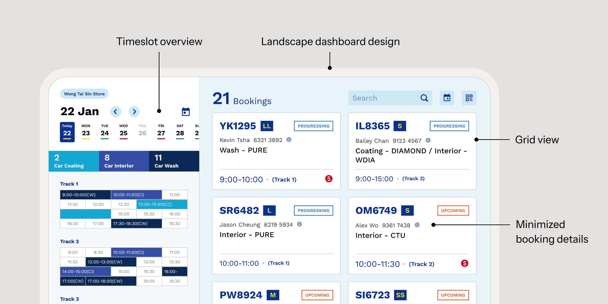

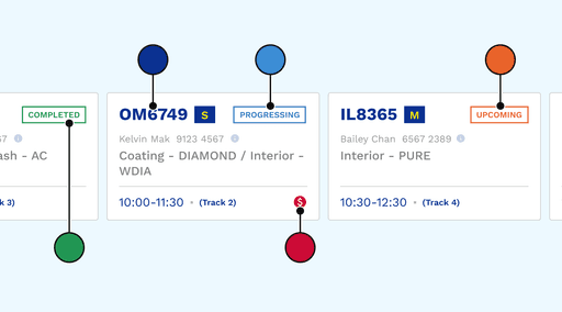

Highlight Important Information with Color
Strategic use of color helped draw the user's attention to the most critical information, enhancing the usability.
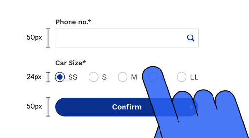

Large Spacing and Button Size
Staff need to wear gloves during their work, ensuring large spacing and buttons improved the ease of use and accessibility.

IDEATION + TESTING
Simplifying the Workflows
By transitioning from paper-based processes to an iPad app, we were able to explore ways to simplify and automate the workflows on a software level. This shift allowed us to streamline the procedures and provide a more efficient experience for users.
IDEATION + TESTING
Simplifying the Workflows
By transitioning from paper-based processes to an iPad app, we were able to explore ways to simplify and automate the workflows on a software level. This shift allowed us to streamline the procedures and provide a more efficient experience for users.
Pain Points in Staff Workflows
After getting in touch with the staff and understanding their day-to-day operations, we identified two key problems that were causing pain points:
Pain Points in Staff Workflows
After getting in touch with the staff and understanding their day-to-day operations, we identified two key problems that were causing pain points:

Confirm Car Defects
Without an official car checking process, customers might attribute any defects to the technician's fault.

Confirm Car Defects
Without an official car checking process, customers might attribute any defects to the technician's fault.

Notify Customers for Pickup
The staff had to contact customers by phone, and some customers didn't answer right away.

Notify Customers for Pickup
The staff had to contact customers by phone, and some customers didn't answer right away.
Validating New Features
As these two features were new for the staff, we believed it was important to test them before finalizing the design. Considering the pace of the COVID-19 pandemic, we sent a mid-stage digital prototype to the staff for online testing.
Validating New Features
As these two features were new for the staff, we believed it was important to test them before finalizing the design. Considering the pace of the COVID-19 pandemic, we sent a mid-stage digital prototype to the staff for online testing.
Digital Car Checking Form
After conducting the user testing session, we received positive feedback on the form and believe it provides a more professional and complete reference for the car defect checking process.
Digital Car Checking Form
After conducting the user testing session, we received positive feedback on the form and believe it provides a more professional and complete reference for the car defect checking process.
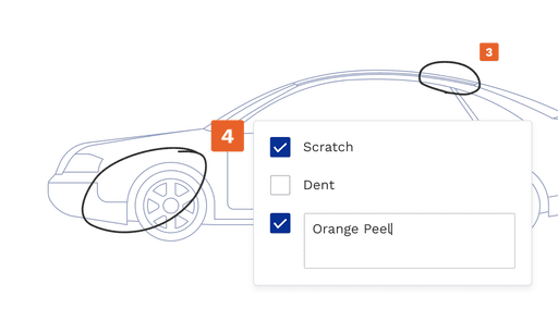

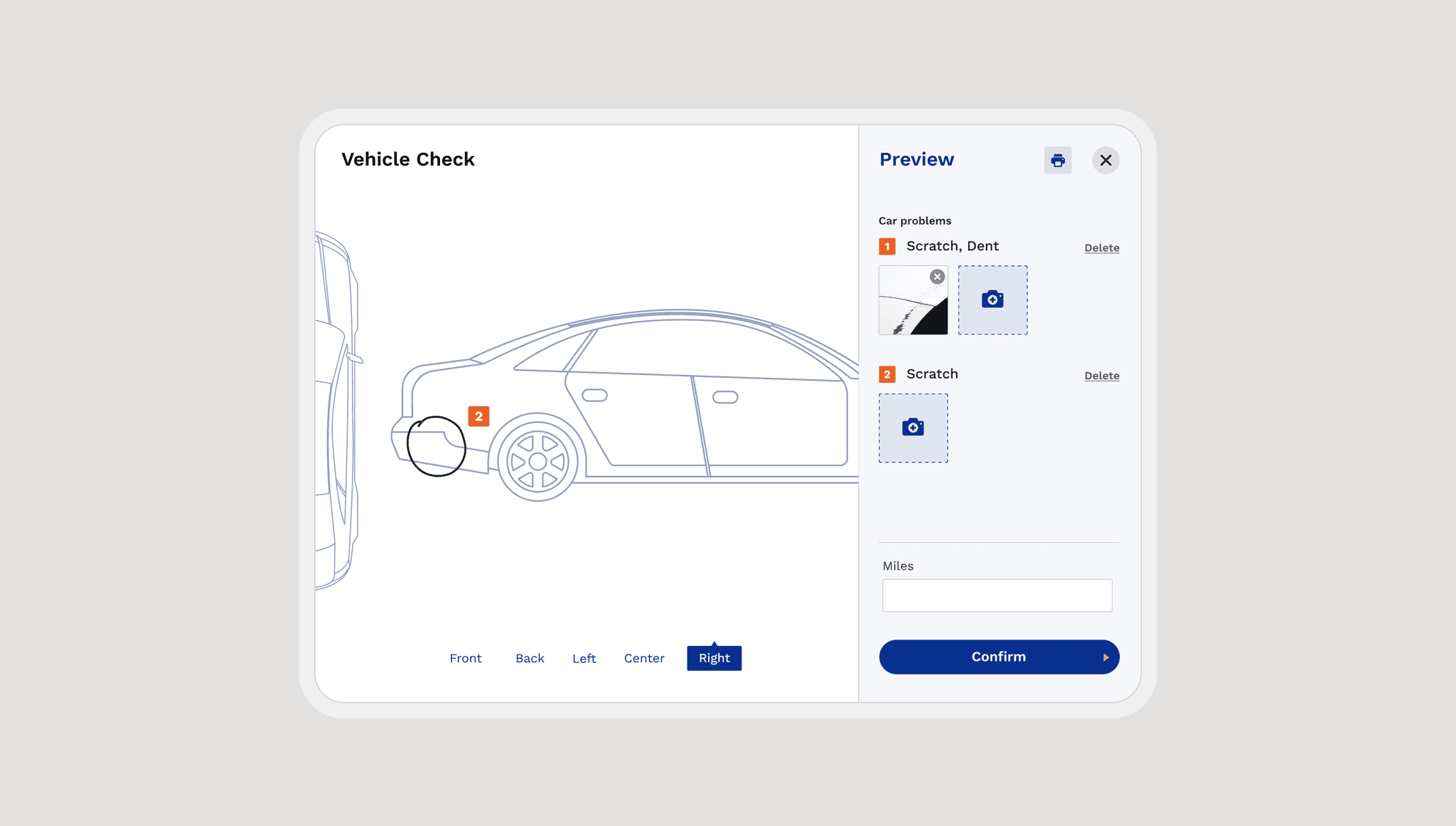
Pen Tool for Defect Circling
Allows users to circle defects directly on the form, offering flexibility for all sizes and types of issues.
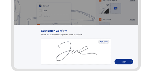

E-Signature from Customers
Customers can confirm the defect details and validate them with their e-signature, ensuring clarity and agreement on the findings.

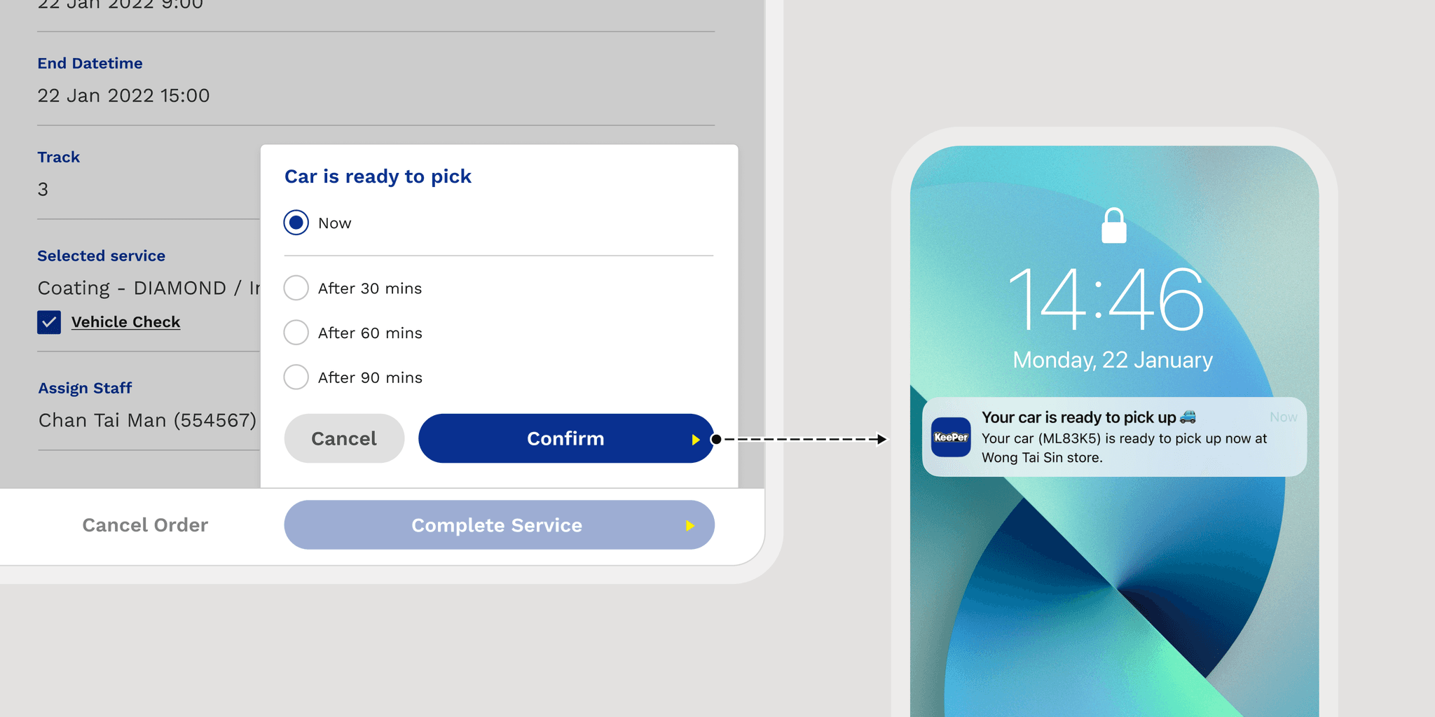
Automated Pickup Notification
When staff complete a job ahead of the scheduled booking end time, they select the updated estimated pickup time and notify the customer by sending it as a mobile app notification.
Automated Pickup Notification
When staff complete a job ahead of the scheduled booking end time, they select the updated estimated pickup time and notify the customer by sending it as a mobile app notification.

IDEATION
Handle Users Who Don’t Use the App
User tests showed that some older customers are hesitant to use the new mobile app and prefer to book services through phone calls or WhatsApp. We identified this need and aimed to make the booking process easier for all customers, regardless of their comfort with technology.
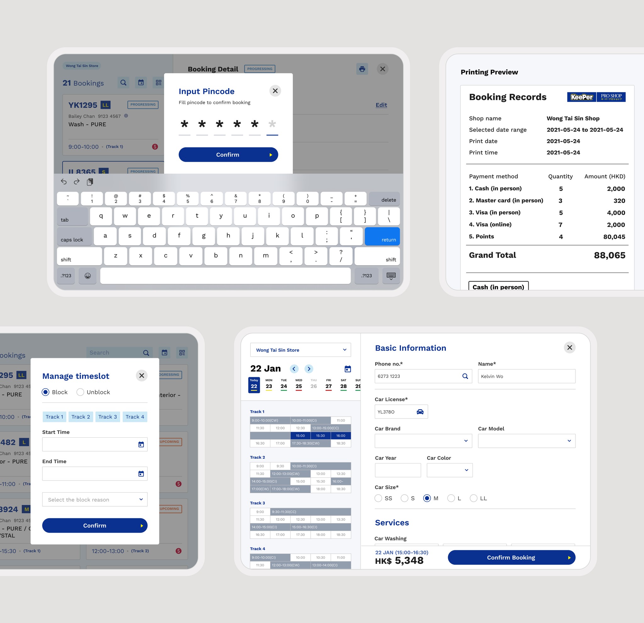
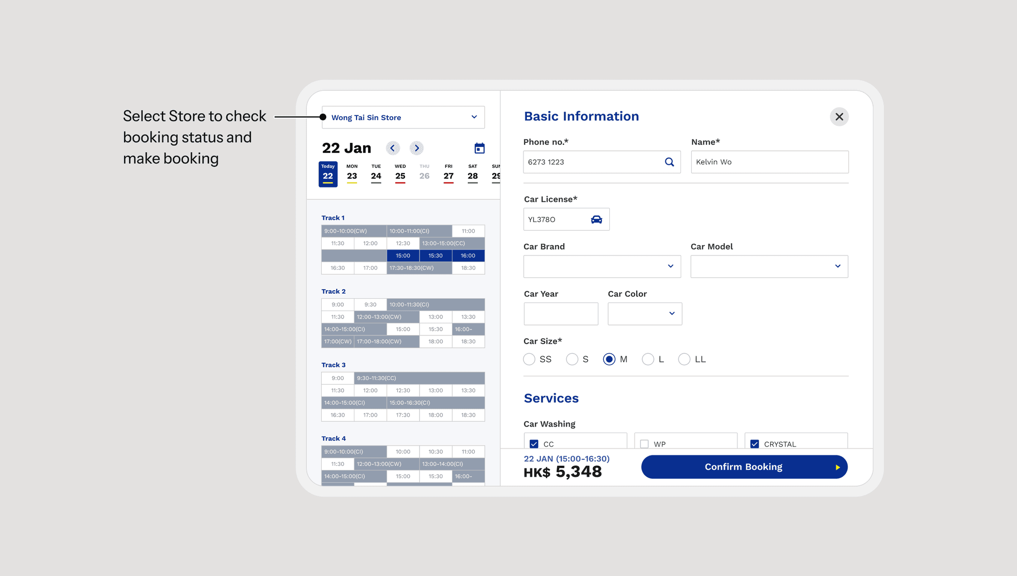
Creating New Bookings through the iPad App
We incorporated a booking creation function to accommodate various booking methods, including walk-ins, phone calls, and messages. Even when the shop is fully booked, the shop manager can assist customers in securing services at another location, ensuring that all customers receive the support they need.

View Other
Case Studies
View Other
Case Studies

