Kowloon Dairy is a dairy market leader in Hong Kong with over 80 years of history.
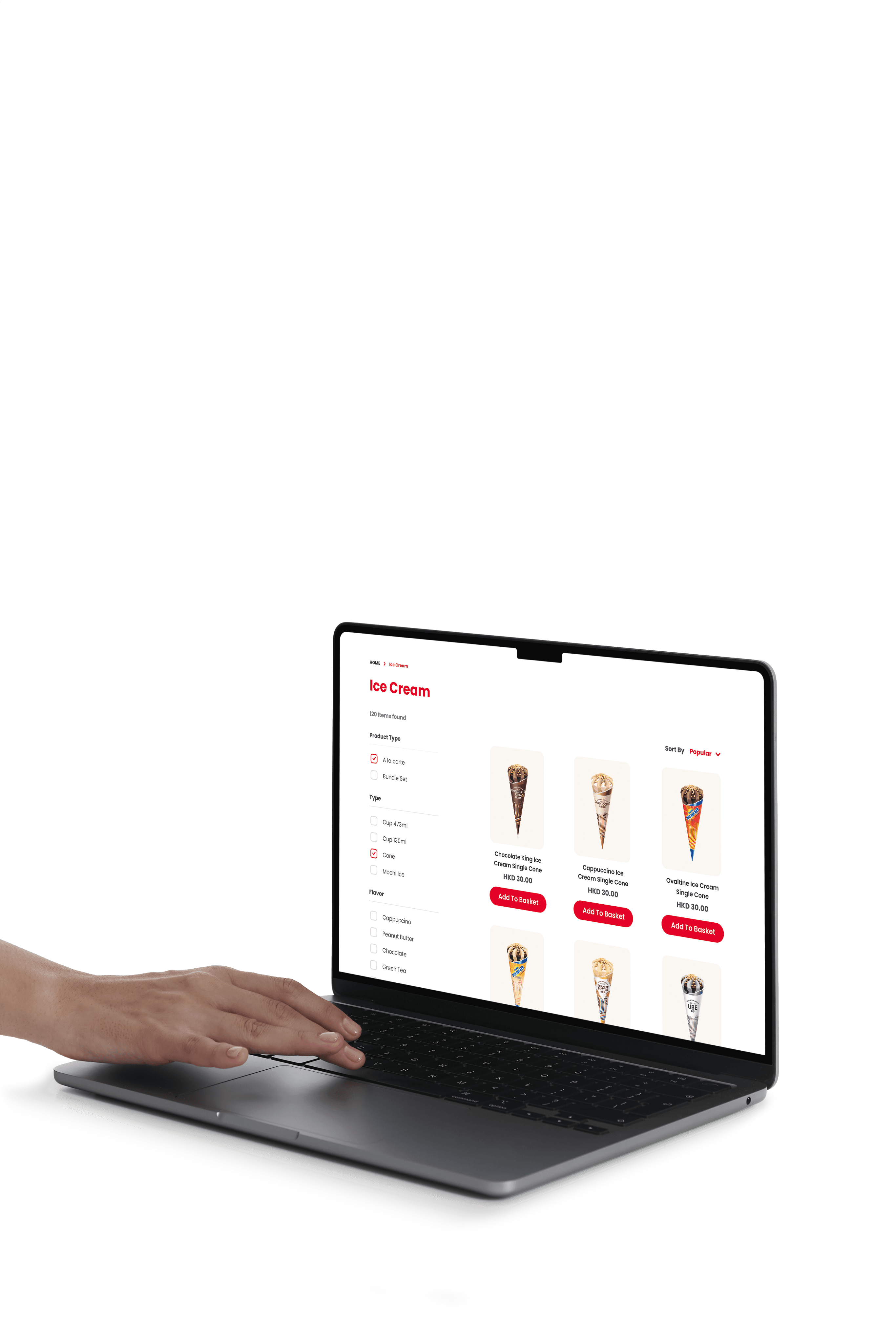
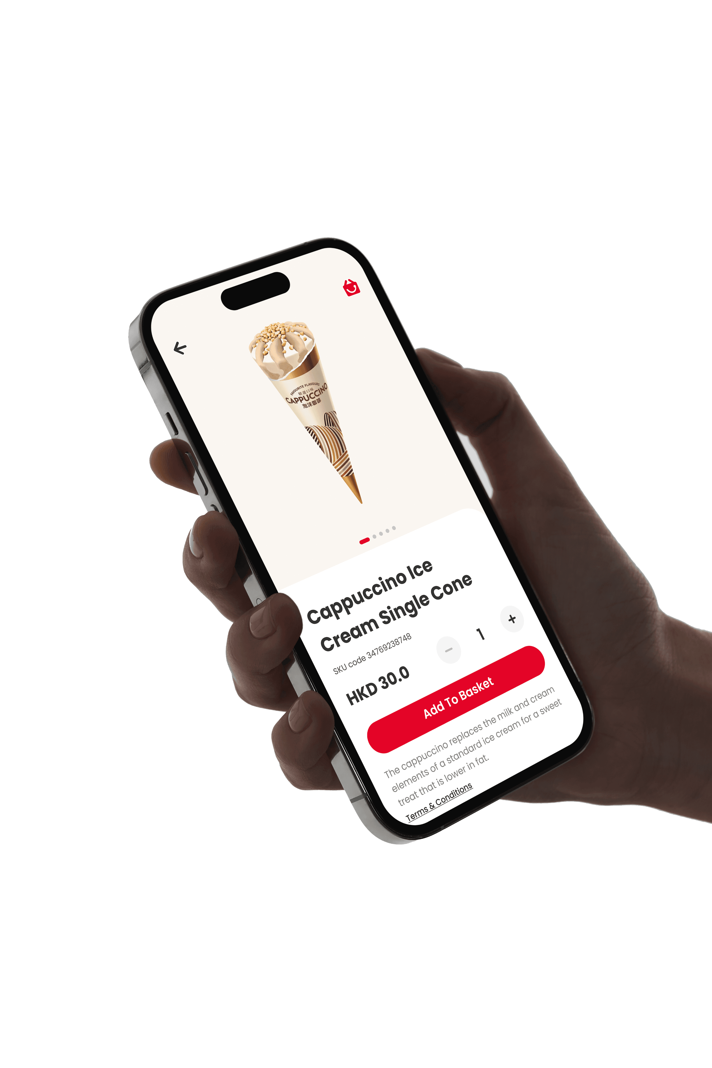
Kowloon Dairy wanted to expand its online market. They needed a new e-shop to sell their dairy subscription plans and products to increase sales.
Product Type
E-Commerce (Progressive Web App)
Team
Jason Cheung (UI/UX Designer)
Ashley Wo (UI/UX Designer)
Nicholas Au (Tech Manager)
Kasay Fung (Project Manager)
Roy Heung (Business Analysis)




BACKGROUND
Starting Point
Kowloon Dairy planned to launch an e-shop with a subscription service for their 80th anniversary, giving us a challenging two-month timeframe to deliver both a website and a mobile app.
BACKGROUND
Starting Point
Kowloon Dairy planned to launch an e-shop with a subscription service for their 80th anniversary, giving us a challenging two-month timeframe to deliver both a website and a mobile app.
My Role
As one of two UI/UX designers, I primarily focused on the visual identity design, UI Kits, and subscription flow. I collaborated with another designer on research, workflow, and interface design. Additionally, I worked closely with the client and engineering team to gather requirements, deliver the design, and ensure quality through a phase-by-phase QA process.
Project Goals
After collecting the client requirements and studying their previous project, the main goals for this project were:
Project Goals
After collecting the client requirements and studying their previous project, the main goals for this project were:

Develop New UI Kits
The first Kowloon Dairy digital product reflects the brand's identity.

Develop New UI Kits
The first Kowloon Dairy digital product reflects the brand's identity.

Clarify Complex Subscription
Provide a simple subscription set-up experience embracing the constraints.

Clarify Complex Subscription
Provide a simple subscription set-up experience embracing the constraints.
PROJECT PLANNING
Adjust Workflow for 2-Month Deadline
With only two months to complete all design work, following a traditional process was unfeasible. To save time, I skipped unnecessary deliverables and collaborated with my co-designer to split the workload effectively, ensuring the development team had the necessary assets to meet the tight deadline.


Optimizing Low-Fi Deliverables
Since e-commerce is a well-established product type with many reference examples, I determined that a full set of low-fidelity wireframes was unnecessary. Instead, I focused on creating the minimum low-fidelity prototypes needed to test the key subscription flow to speed up the design process.
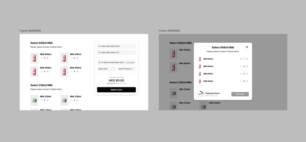

Quick low-fi layout to communicate with stakeholders
Quick low-fi layout to communicate with stakeholders
UI DESIGN
Develop New UI Kits
Kowloon Dairy's e-shop is their first online platform. The public was only exposed to the brand through advertising and offline promotional materials. As there is no existing design guideline for the online platform, it is challenging to create a design system that enables users to associate the platform with the brand.
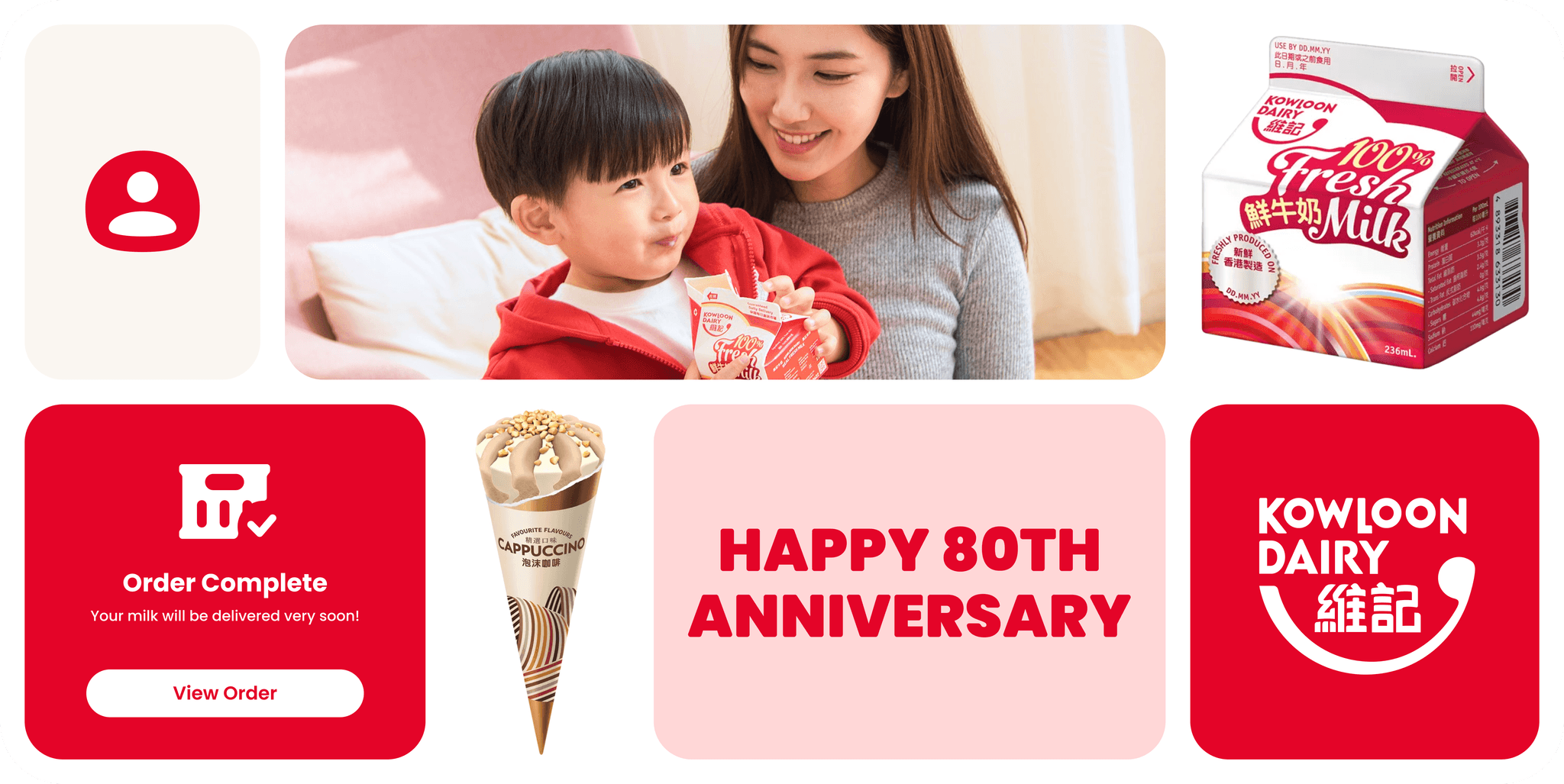

Concentrating Single Representative Color
Kowloon Dairy is a historic dairy brand in Hong Kong, and its primary brand color, red, is highly recognizable and strongly associated with the brand. I used red as the primary color to highlight key elements in the new design system.
Concentrating Single Representative Color
Kowloon Dairy is a historic dairy brand in Hong Kong, and its primary brand color, red, is highly recognizable and strongly associated with the brand. I used red as the primary color to highlight key elements in the new design system.


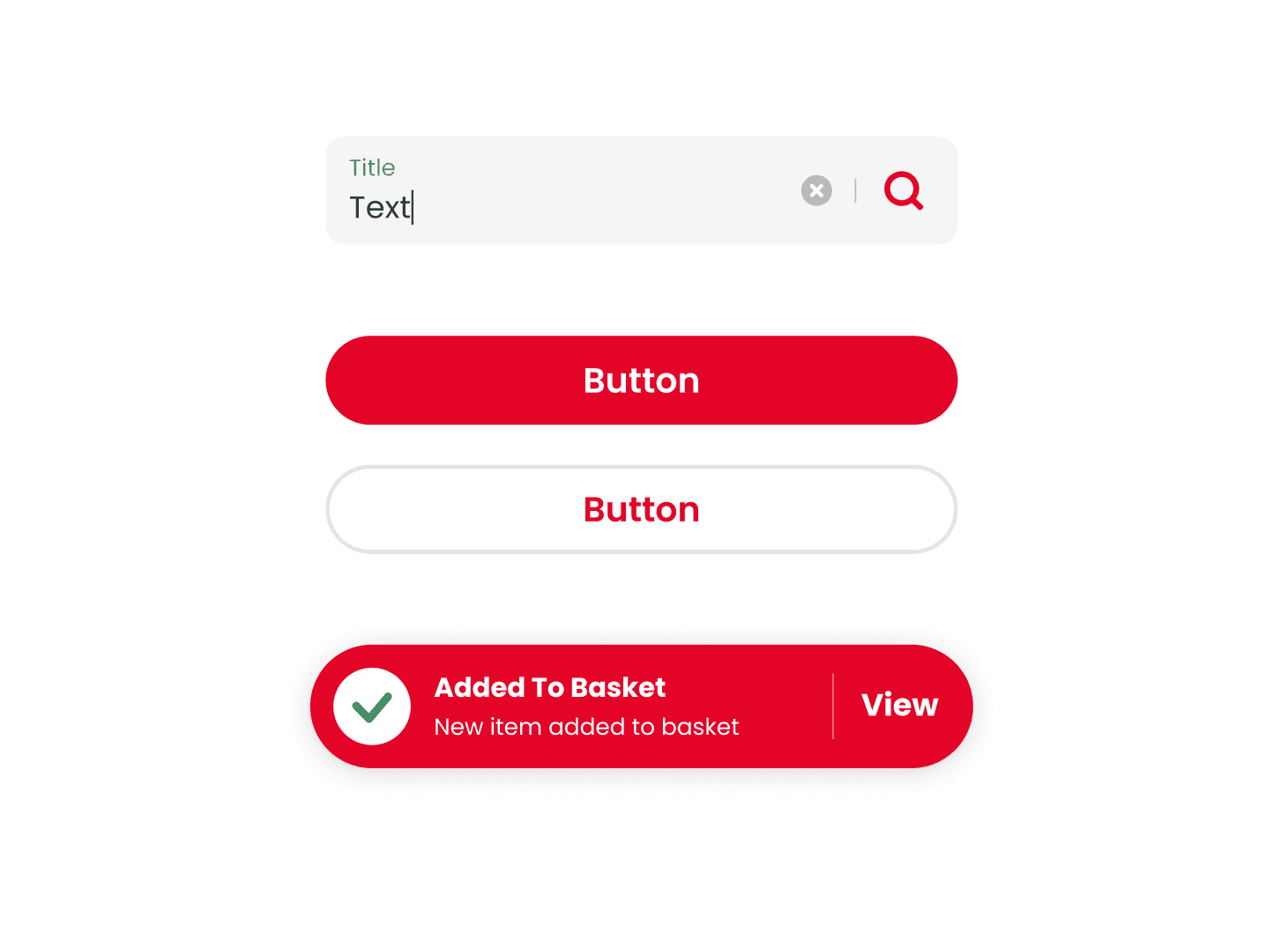

Amplify Bold Shapes Inspired by Products
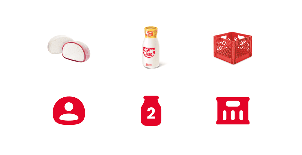
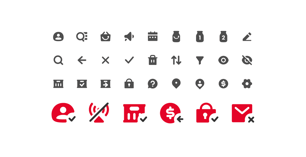
I applied a rounded font, curvy shapes, and thick strokes to help create a friendly and playful vibe. A tailor-made icon set inspired by their hero products' shape increases coherence with the brand identity.
Amplify Bold Shapes Inspired by Products
I applied a rounded font, curvy shapes, and thick strokes to help create a friendly and playful vibe. A tailor-made icon set inspired by their hero products' shape increases coherence with the brand identity.


Minimal UI Meets Client's Needs and Resources
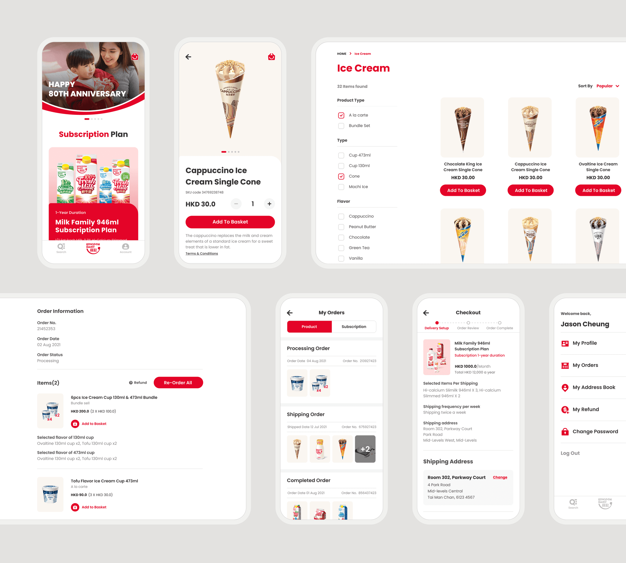
Understanding Kowloon Dairy's graphic resources and the nature of their products, allows me to prioritize minimalism while ensuring that the design remains aligned with the client's identity and goals.
Minimal UI Meets Client's Needs and Resources
Understanding Kowloon Dairy's graphic resources and the nature of their products, allows me to prioritize minimalism while ensuring that the design remains aligned with the client's identity and goals.
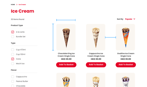

Larger Design Elements to Accommodate Limited Items
The larger image, spacing, and font sizes ensure that the limited items on the Kowloon Dairy website do not appear empty. This design also fosters a friendly and inviting atmosphere.
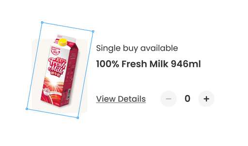

Colored Backgrounds with Existing Transparent Images
I suggested using a colored product background to highlight the vibrant brand colors regarding their graphic resources for photo background removal.

UX DESIGN
Clarify Complex Subscription
The subscription rules proposed by Kowloon Dairy differ from typical grocery subscription plans. Additionally, grocery subscriptions are not common in Hong Kong. This unfamiliarity and complex rules complicate the subscription process.
UX DESIGN
Simplfy Complex Subscription Rules
The subscription rules proposed by Kowloon Dairy differ from typical grocery subscription plans. Additionally, grocery subscriptions are not common in Hong Kong. This unfamiliarity and complex rules complicate the subscription process.
UX DESIGN
Clarify Complex Subscription
The subscription rules proposed by Kowloon Dairy differ from typical grocery subscription plans. Additionally, grocery subscriptions are not common in Hong Kong. This unfamiliarity and complex rules complicate the subscription process.
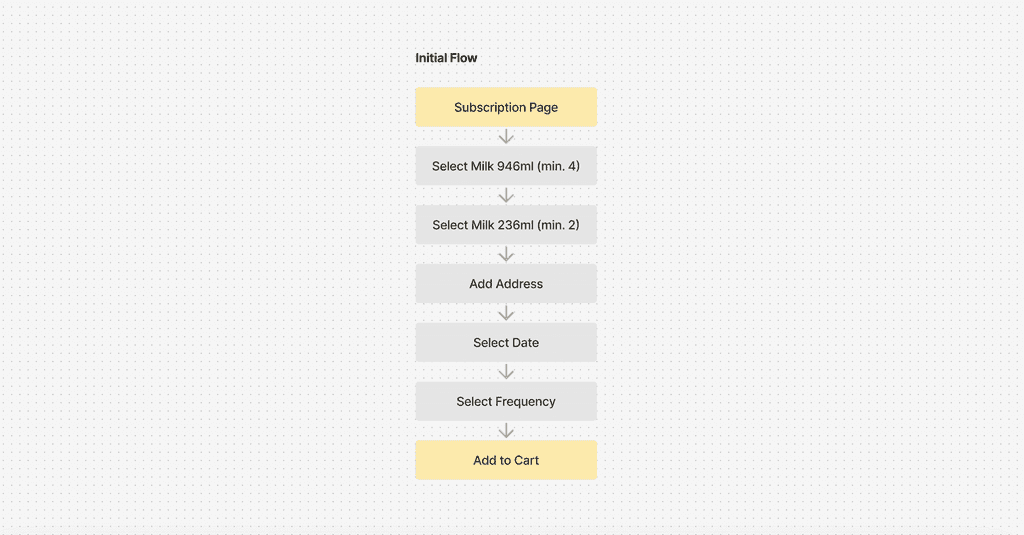

Referencing Successful Subscription Platforms
Grocery subscription services are rare in Hong Kong, so I referenced successful international brands. These platforms often offer flexible subscription rules that allow users to customize their plans, providing valuable insights for creating a model tailored to the local market.
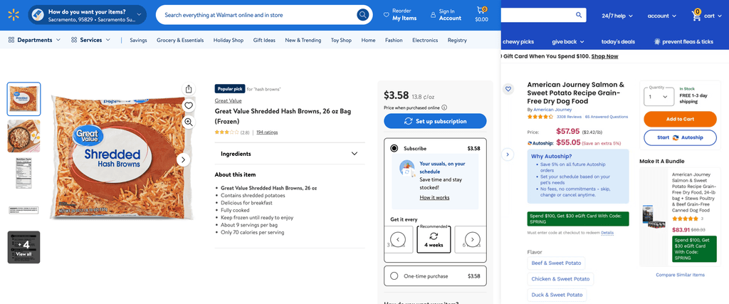

Screenshot of Walmart & Chewy
Screenshot of Walmart & Chewy
Attempted to Simplify Subscription Setup Flow on Product and System Levels
I aimed to simplify the subscription setup by proposing a new workflow. By referencing subscription flows from well-known e-commerce platforms, I suggested providing more flexibility in product options. I also recommended moving the address, shipping date, and frequency selections to the checkout process to prevent users from feeling overwhelmed by too much information on one screen.
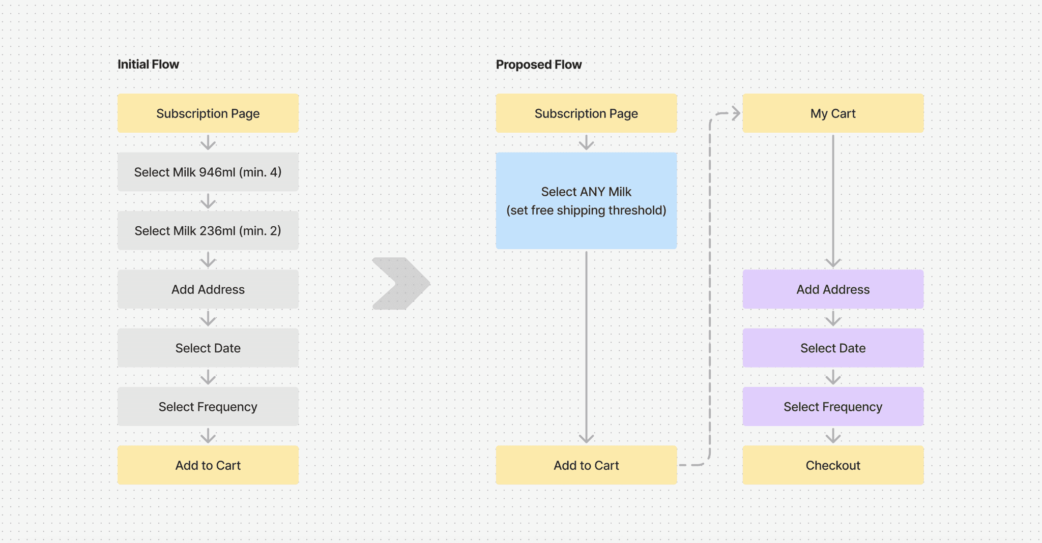

Rejected by Business and Technical Constraints
The proposal was ultimately rejected due to business and technical constraints. The product owner insisted on maintaining a limited selection of products for the subscription plan. Additionally, the address setup and frequency impacted the final price of the plan, making it technically impossible to transfer this process from the subscription page to the checkout with the selected e-commerce system.
Optimize Setup Flow on the Design Level
In response to the identified constraints, I recognize that, as an external designer, there is little I can do to influence the business and technical limitations. Therefore, I focused on exploring several design-level solutions and developed two ideas to simplify the choices users need to make.
Usability Testing to Determine the Better Design
I created a quick prototype and invited 6 colleagues to test the design and determine which option was better. To ensure unbiased feedback, I selected colleagues not directly involved in the project.
Usability Testing to Determine the Better Design
I created a quick prototype and invited 6 colleagues to test the design and determine which option was better. To ensure unbiased feedback, I selected colleagues not directly involved in the project.
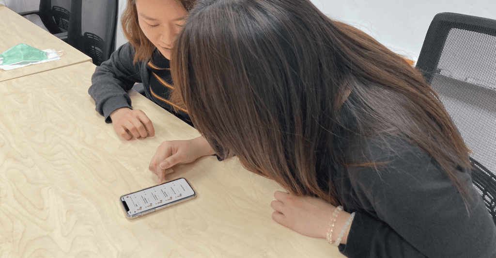

Internal usability testing with colleagues not involved in the project
Internal usability testing with colleagues not involved in the project
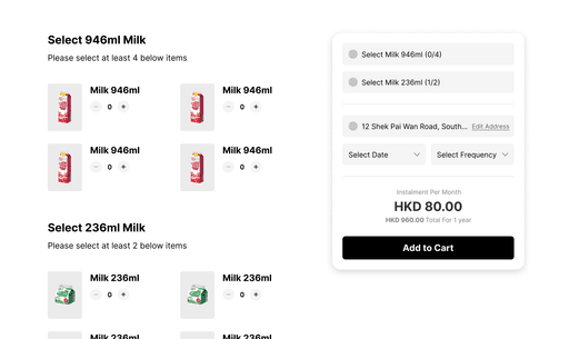

Idea A: Plan Overview and Product Listing on One Page
Show as a side-by-side view on desktop and a long scroll on mobile, allowing users to easily compare options.
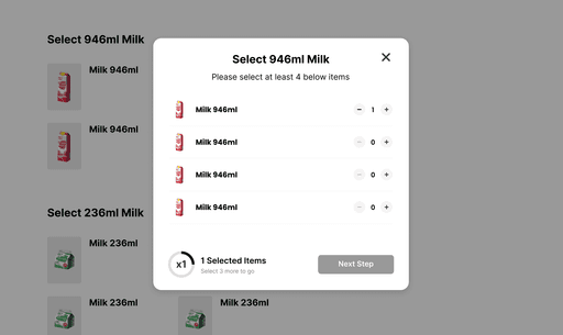

Idea B: Step-by-Step Guidance on Multiple Screens
Guiding the user through the selection process step-by-step, using pop-ups to present options and details in a structured way.
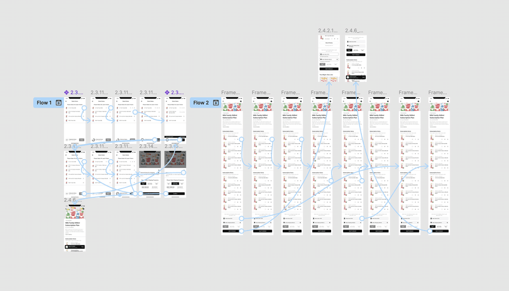

Prototyping with Figma
Prototyping with Figma
Unexpected Result: Idea A Wins
I assumed that Idea B was a better solution due to its step-by-step layout, which is less likely to lead to failures, and this was supported by the test results. However, during the discussion session, most users expressed a preference for Idea A.
Unexpected Result: Idea A Wins
I assumed that Idea B was a better solution due to its step-by-step layout, which is less likely to lead to failures, and this was supported by the test results. However, during the discussion session, most users expressed a preference for Idea A.
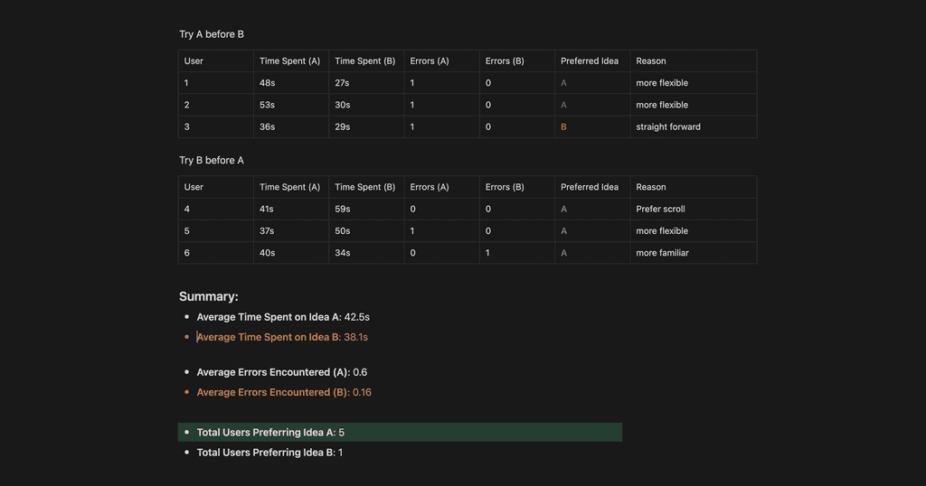

Green represents Idea A, orange represents Idea B
Green represents Idea A, orange represents Idea B
Efficiency is Not Equal to User Satisfaction
While Idea B proved to be more efficient, users favored Idea A for its flexibility. They appreciated the ability to browse and select different item types in a way that suited their preferences, as Idea A made it easier to change selections simply by scrolling. This highlights that user preferences can sometimes outweigh efficiency metrics in the design process.
BEFORE & AFTER
Finalized Subscription Setup Flow
After consolidating the results from the tests and refining the UI, we arrived at the finalized design outlined below.
BEFORE & AFTER
Finalized Subscription Setup Flow
After consolidating the results from the tests and refining the UI, we arrived at the finalized design outlined below.
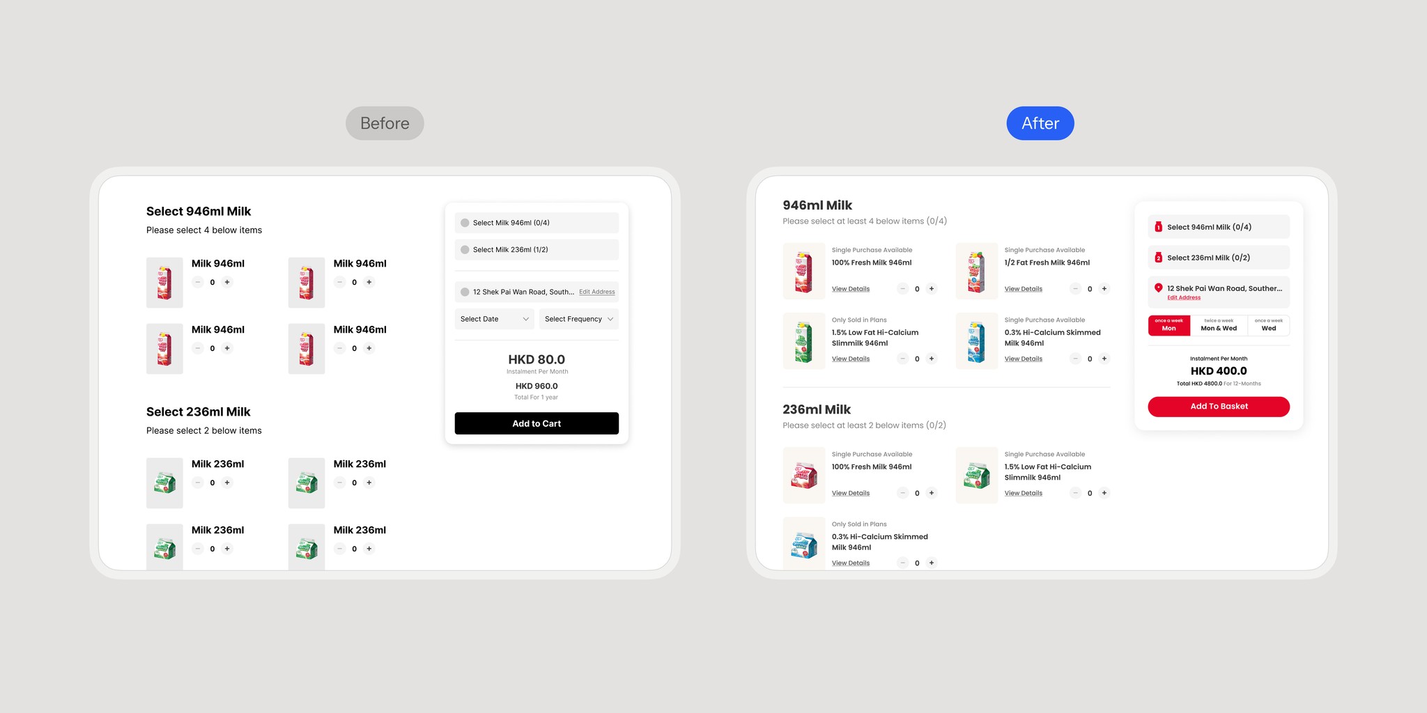

Floating Plan Overview Card for Desktop Web
This feature provides users with a clear visual cue, enhancing their understanding of what details are needed while navigating the site.
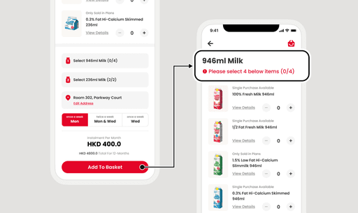

Redirect to the Unselected Section
If users haven't selected all required items, it will scroll to that section when they click on the plan overview.
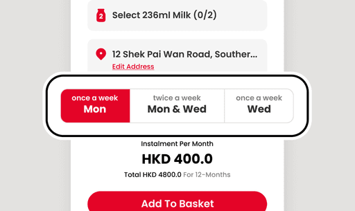

Merge Shipping Date and Frequency into One Tab
This simplification requires fewer clicks to make changes, reduces clutter, and improves usability.
OUTCOME
Hit the Deadline!
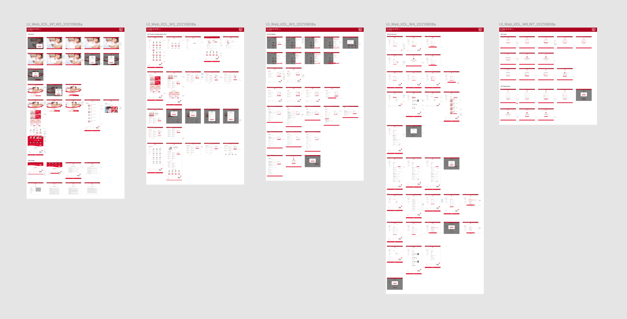
We successfully handed off the design within 2 months, ensuring that all deliverables were completed on schedule to allow enough development time.
OUTCOME
Hit the Deadline!
We successfully handed off the design within 2 months, ensuring that all deliverables were completed on schedule to allow enough development time.
250+
250+
Screens created
3
3
Revised versions
2
2
Month timeframe


View Other
Case Studies
View Other
Case Studies

